Passionate about Intuitive Dashboards?
Over the course of my career, I’ve created several technical dashboards that I’m particularly proud of. Below is a sampling of some of the dashboards I’m most proud of.
[Client]
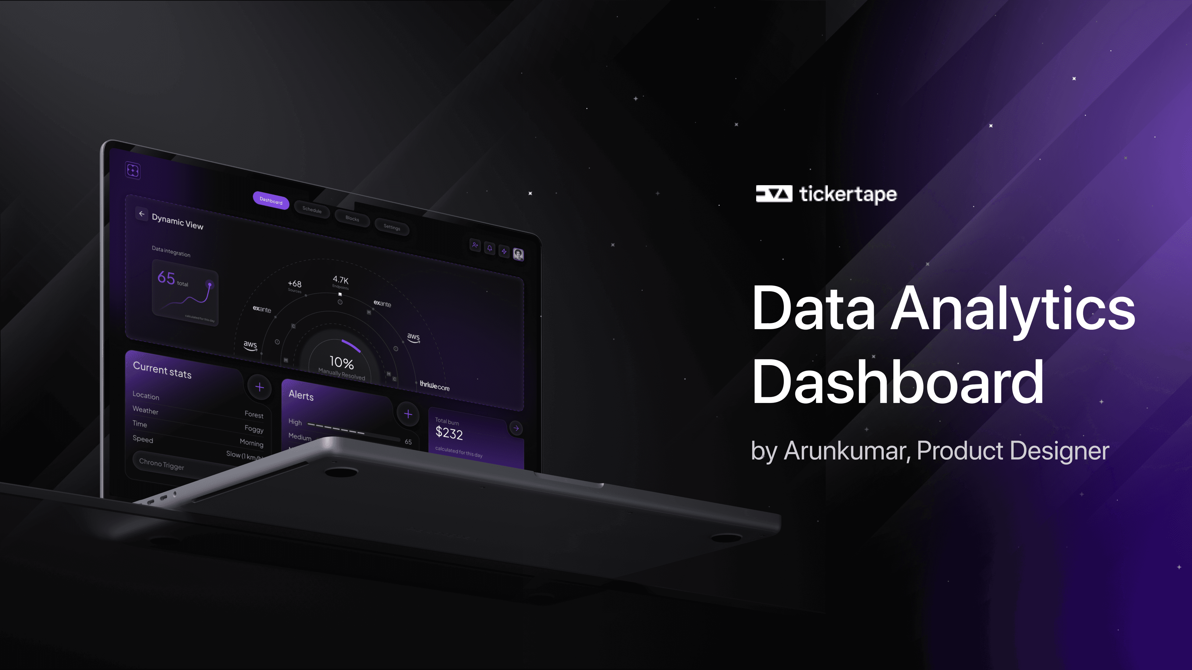
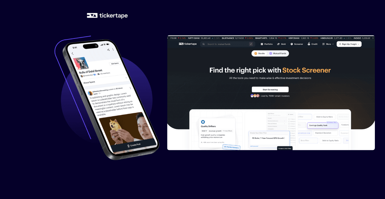
Tickertape
[Year]
2022
[Services]
Product Design and User Research
[Catagory]
Technology & Fintech
1. Tickertape: Retail Investor Portfolio management
Why are we doing this?
The existing portfolio tool is primarily a data display platform, resembling a spreadsheet without offering deeper insights or actionable information about the user’s investments.
Users lack motivation to import their holdings into Tickertape since the data provided is similar to what their broker offers.
The goal for Tickertape Portfolio is to become a comprehensive, “one-stop shop” for all the user’s portfolio management needs.
Users will be able to seamlessly integrate all their investments, including stocks, mutual funds, smallcases, gold, and other assets, into the Tickertape Portfolio.
The new portfolio tool will provide users with valuable insights, analytics, and recommendations, allowing them to manage and optimize their investments effectively without needing to consult multiple platforms.
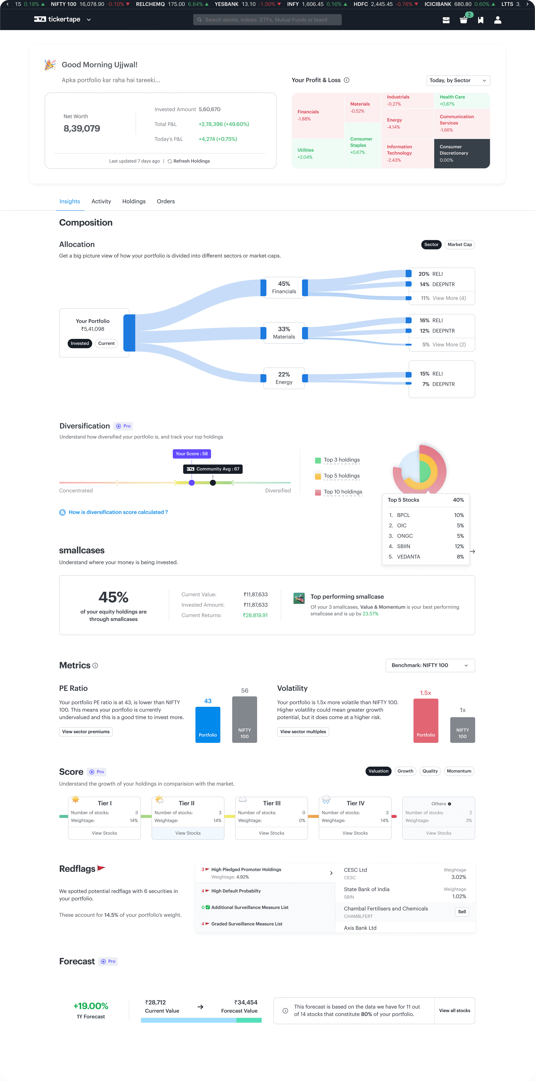
https://www.tickertape.in/portfolio/equity
What is the user problem?
Fragmented Holdings Management: Users are struggling with a disjointed experience when managing their portfolios. Stocks are held with one broker, mutual funds with multiple apps, and other investments scattered across different platforms, making it difficult to get a unified view of their assets.
Limited Insights and Optimization: The current portfolio tool fails to provide users with meaningful insights or recommendations on how to optimize their investments. Users are unable to easily assess the performance and potential improvements for their portfolios.
Inadequate User Experience: The existing portfolio system is essentially a basic data display, offering little more than what a spreadsheet does. This lack of advanced features and analytics results in a poor user experience, leaving users unsure about the overall health and potential of their investments.
What is the business opportunity for CRISIL?
Market Differentiation: Many competitor tools, such as Upstox, offer limited or no portfolio analysis and insights.
Addressing Gaps in Current Offerings: Free portfolio insights are rarely offered by brokers, and when they are, they often provide a fragmented and incomplete experience.
Monetization Through Premium Features: Introducing advanced features, such as price forecasts and detailed analytics, can drive user interest in paid pro memberships. These premium offerings can provide a significant revenue stream while adding value for users.
What are the design constraints/goals?
There is a lot of financial data points, so we need to ensure we don’t overwhelm the user
The goal is to make the Portfolio page a fun destination. It has to feel personal and energetic and interesting. Users should feel good about visiting their Portfolio to educate themselves and even if it isn’t performing well they should feel good about opening it and understanding what they can do better.
Design proposal: Why are we choosing this path?
The idea is to make “a Portfolio that cares about you”. It talks to you and explains to you what it is that you already have, how it’s doing. And it explains to you everything and makes sure even if your stocks are going down or the market is in a downturn, it tells you that it’s alright - let’s figure out what’s happening.
The Portfolio should feel to the user like it is their “Investment and Wealth Companion” that takes away anxiety, teaches something new everytime, doesn’t have a boring personality, is smart, quick, quirky, fun and educational.
Design proposal: What tradeoffs did we make?
We don’t have data of the orderbook and hence can’t show a lot of analytics such as XIRR or time series analysis, etc.
We have only NSE data and not BSE.
Jobs to be done
Help me see my entire Portfolio together so that I don’t have to continually shift platforms and context.
Help me understand more about my portfolio so that I understand what is wrong and how I may improve it.
Help me understand whether I want to sell, buy or hold something in my Portfolio so that I can time the market well make the best use of my investments.
Target users
Novice retail investors
Advanced retail investors
Team
1 product manager, 2 front end developers, 1 back end developer
Role
Research, UX/UI design, Design Systems
Interfaces
Android, Web app
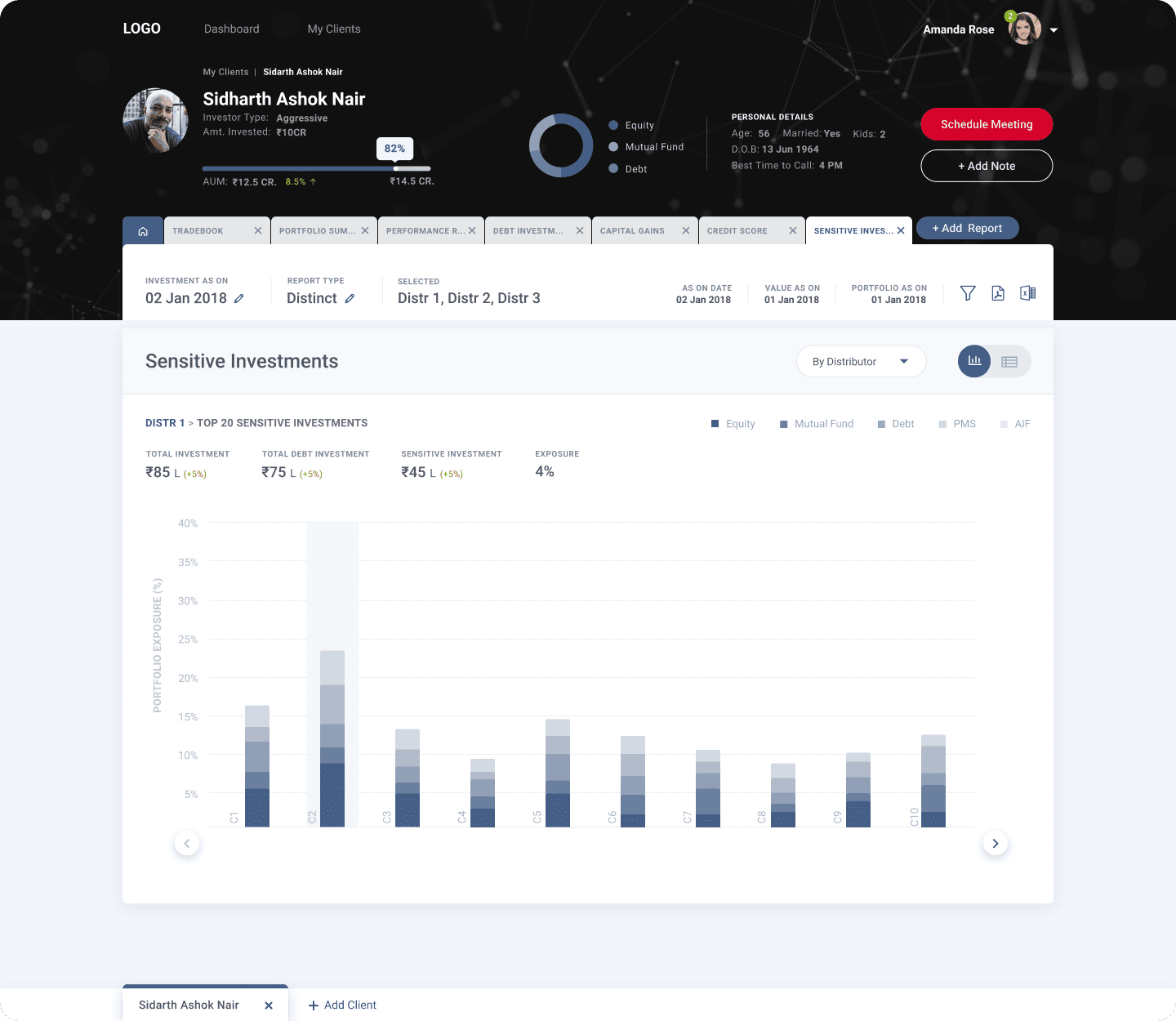
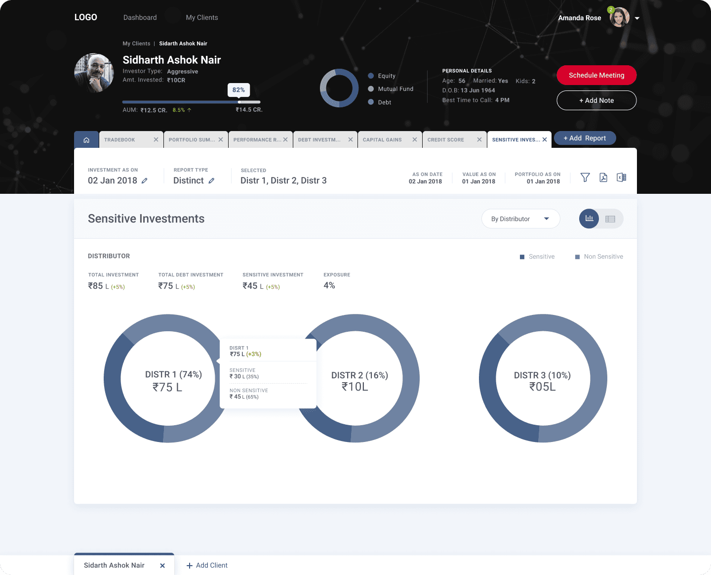
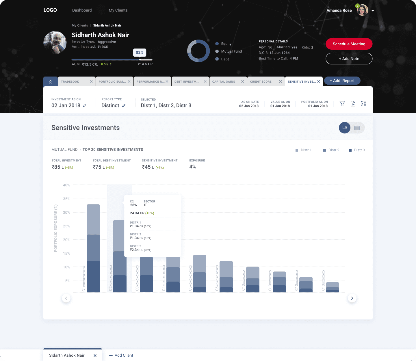
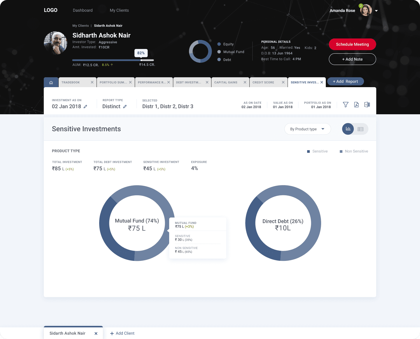
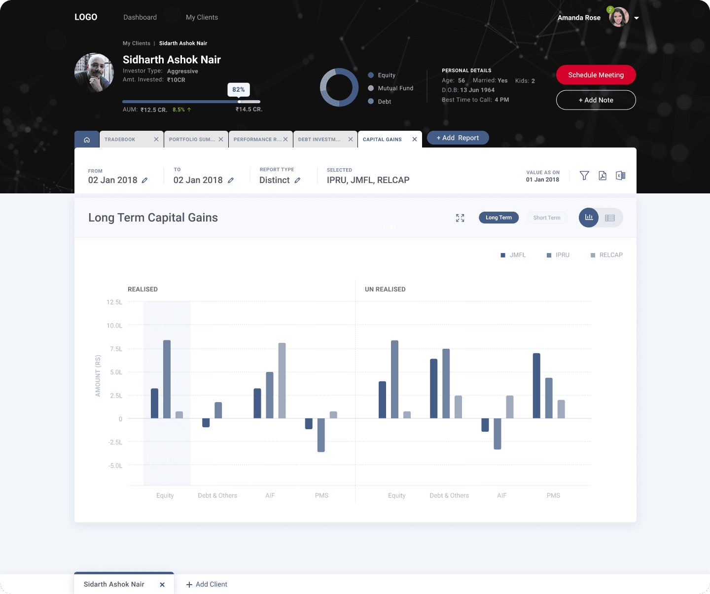
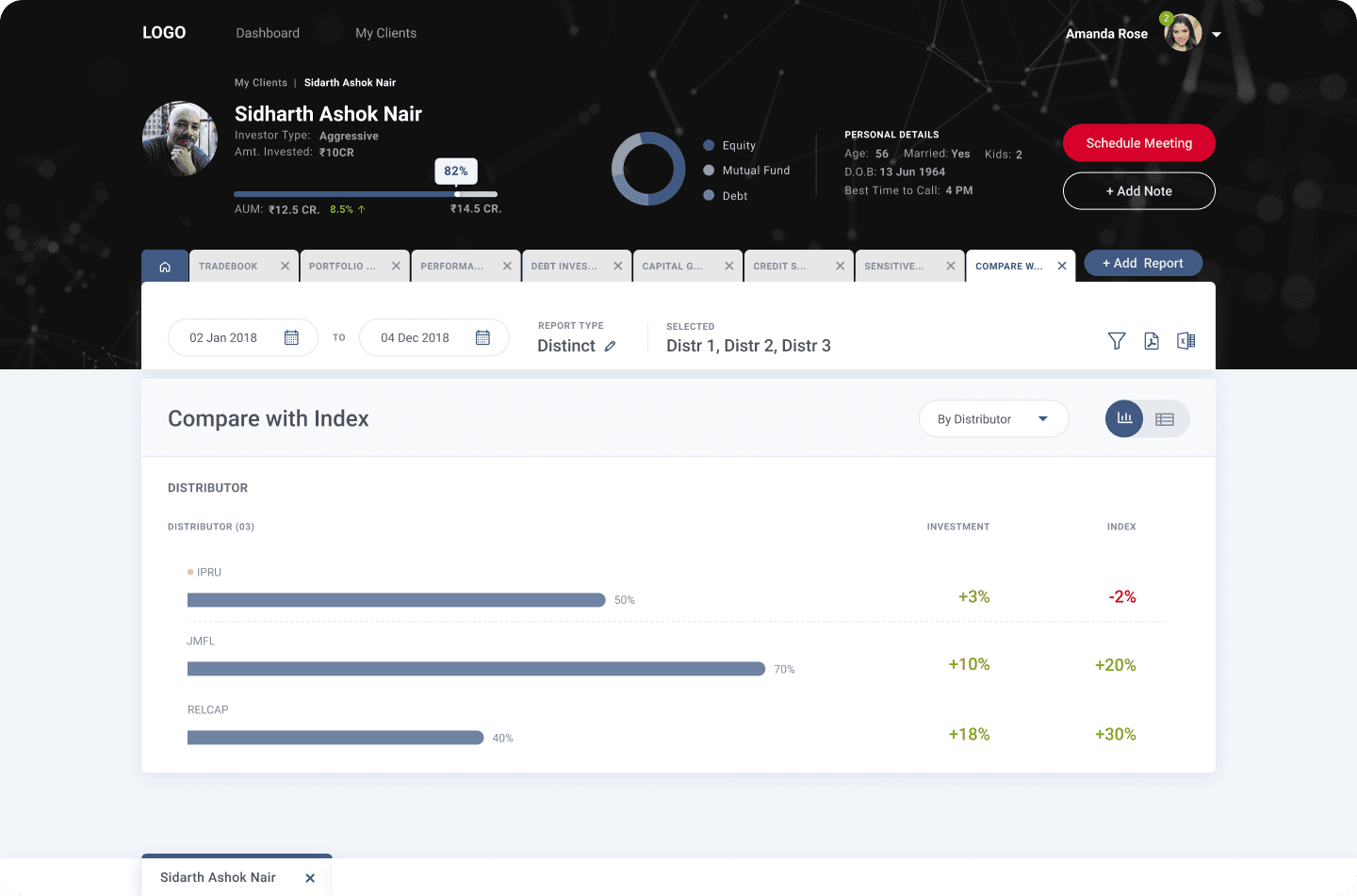
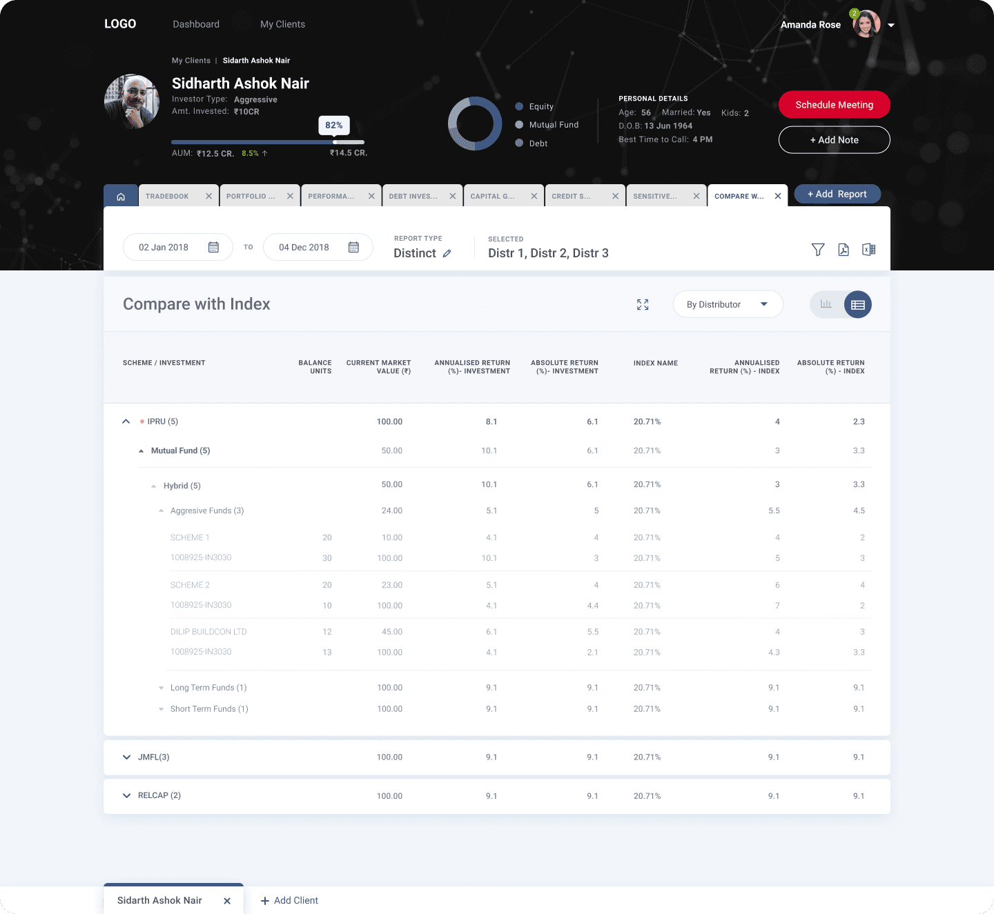
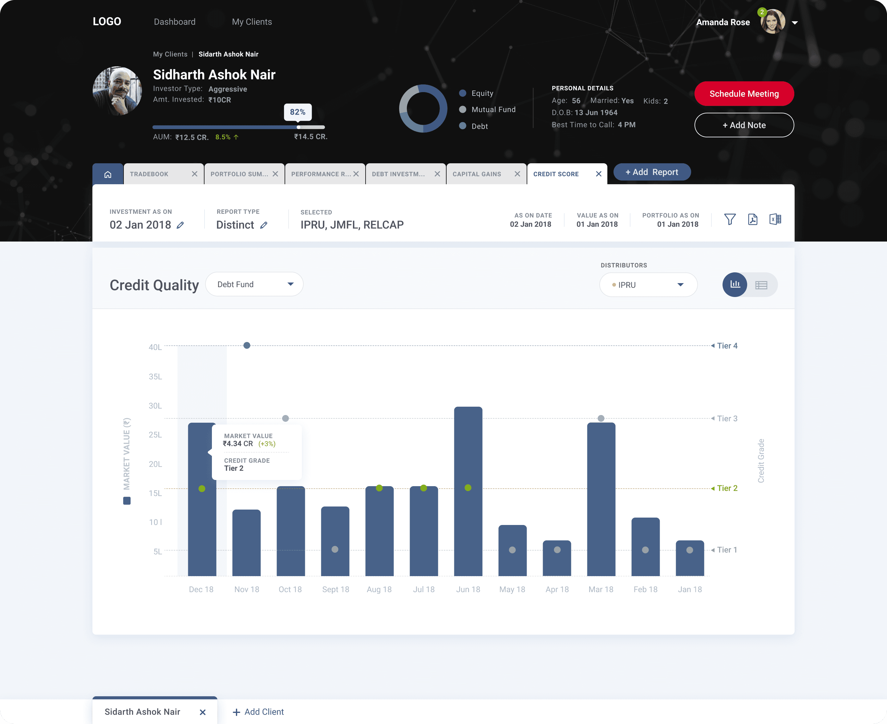
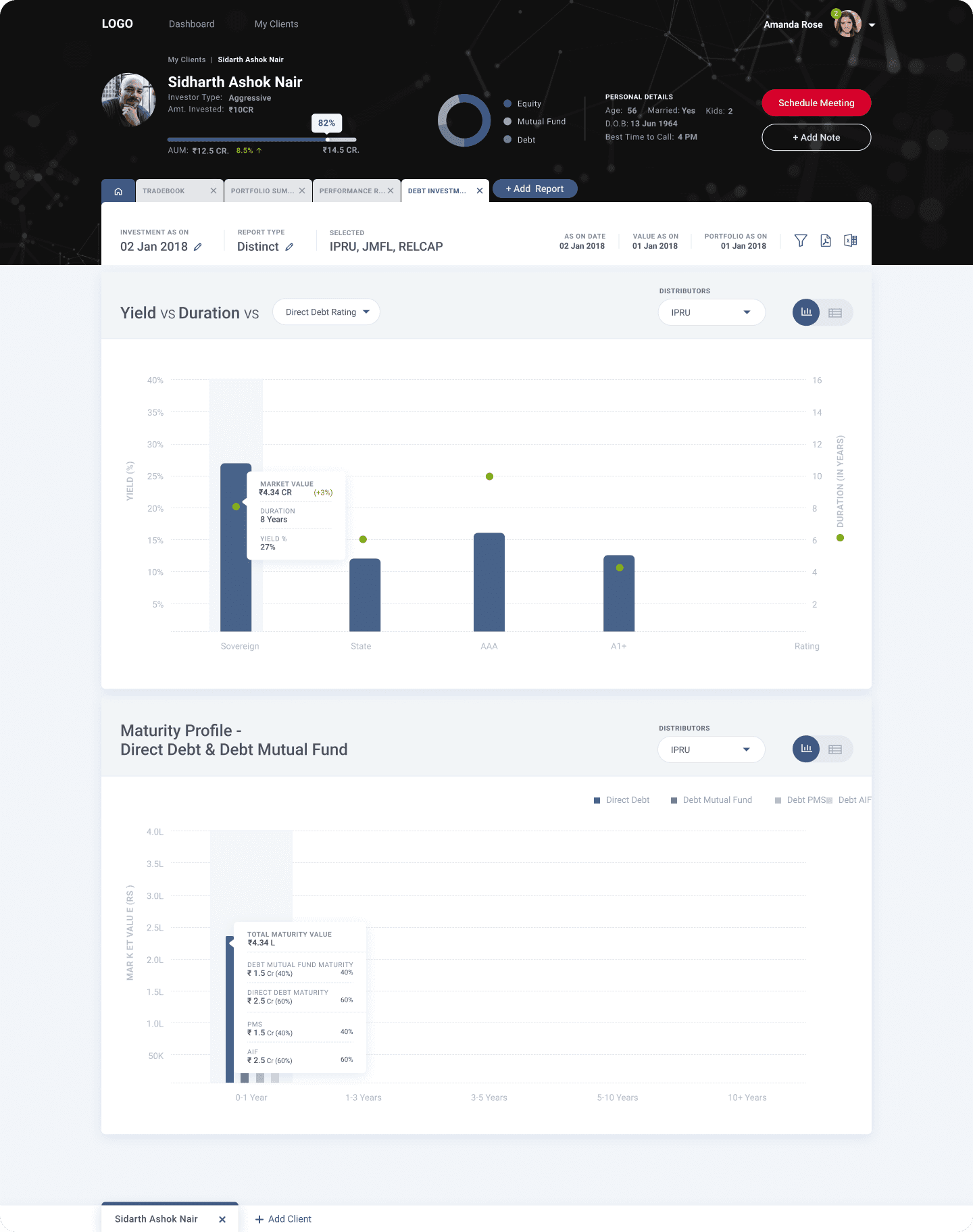
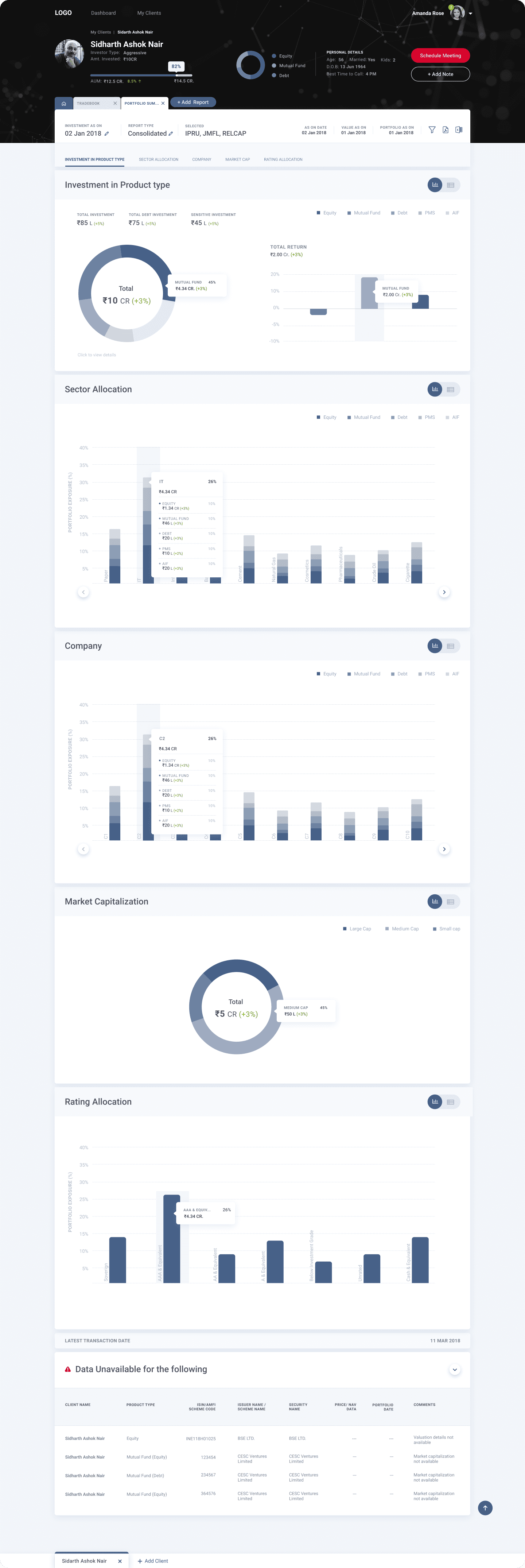
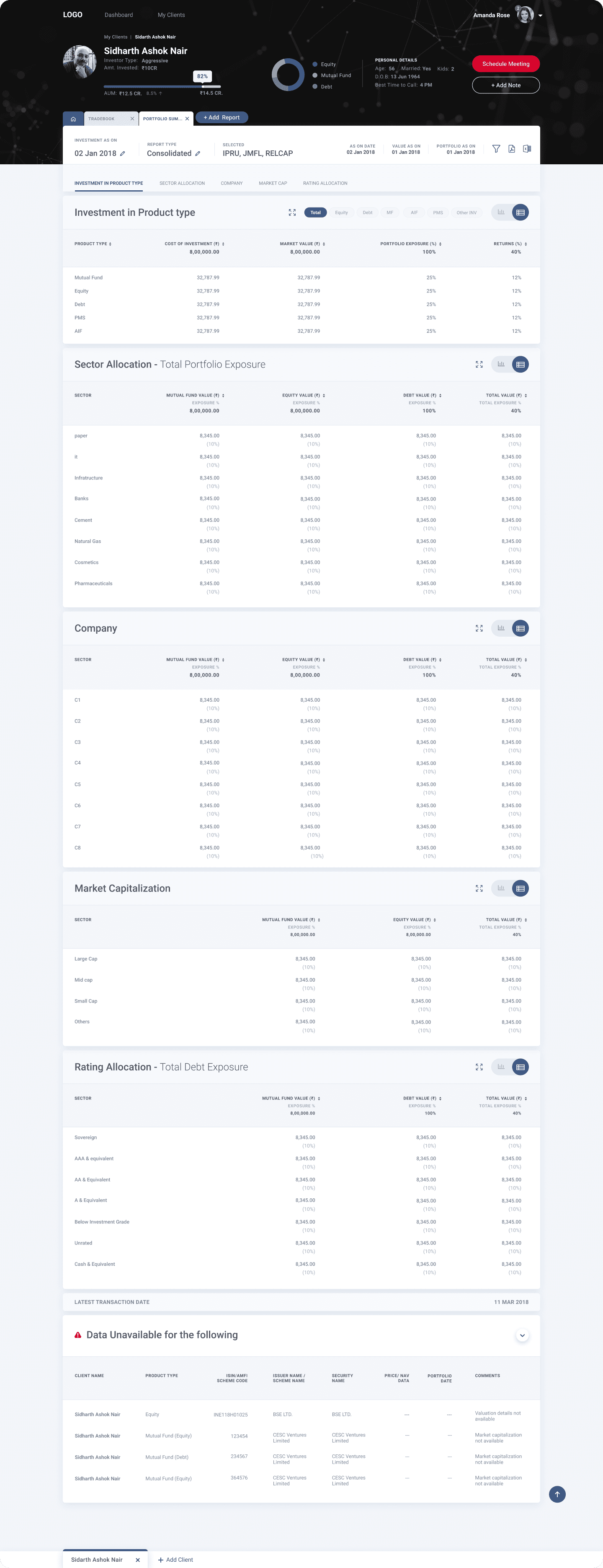
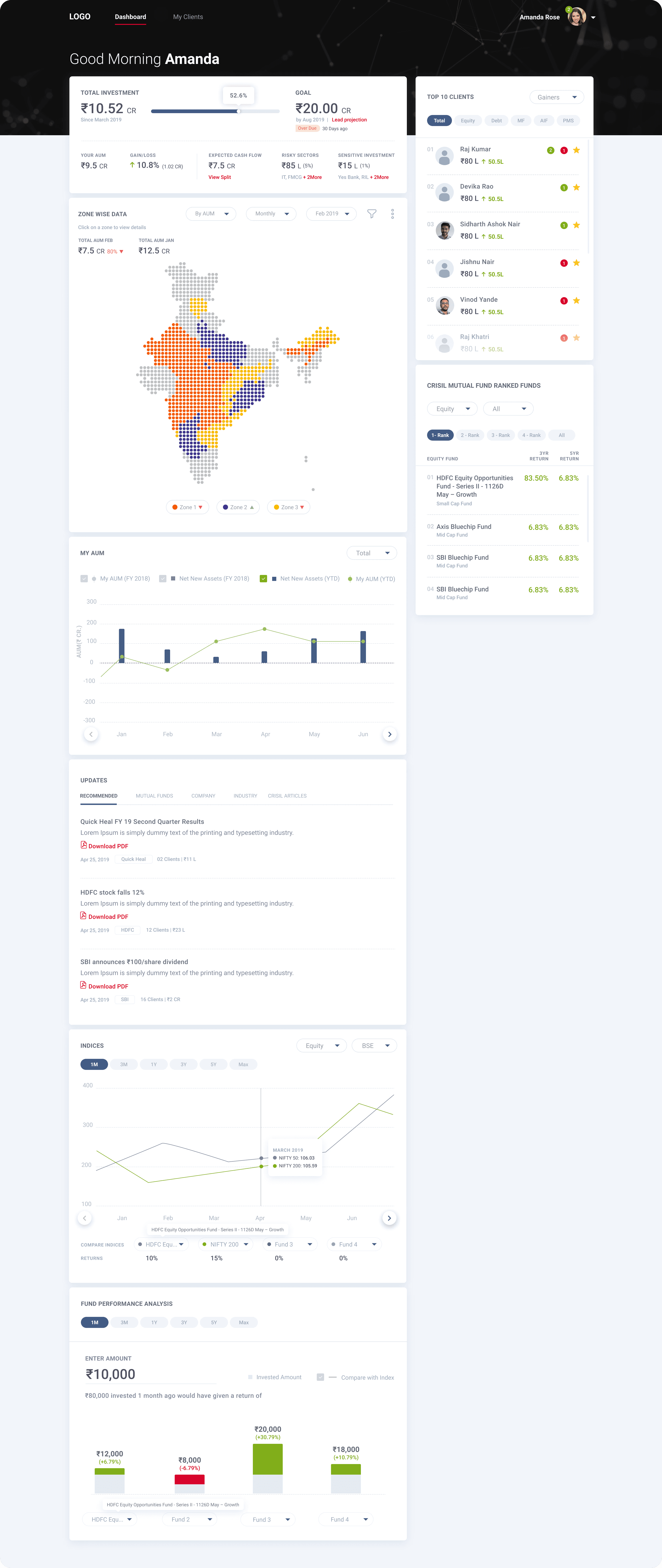
2. CRISIL: Client Portfolio Management
Why are we doing this?
CRISIL, a global analytics company, approached Screenroot, a product design agency where I previously worked, to create a white-labeled Client Portfolio Management dashboard for their customers in the financial sector.
Why is CRISIL doing this?
Enhance client satisfaction by providing a customizable portfolio management solution.
Stay competitive in the financial services market by offering modern, scalable tools.
Improve data accuracy and reporting capabilities for better decision-making.
What is the user problem?
Current tools that they have are legacy, outdated and not intuitive to use.
Difficulty in managing large-scale portfolios with diverse asset classes.
Limited customization options in existing portfolio management tools.
Challenges in tracking and analyzing performance metrics effectively
What is the business opportunity for CRISIL?
Attract and retain more clients by offering a sophisticated, customizable tool.
Generate additional revenue streams through subscription or licensing models for the white labeled solution.
Differentiate CRISIL from competitors with a state-of-the-art portfolio management solution.
What are the design constraints/goals?
Ensure the tool is highly customizable to cater to different client needs.
Maintain a user-friendly interface despite the complexity of functionalities.
Design for scalability to handle increasing volumes of data and users.
Ensure accessibility and usability across different devices and platforms.
Jobs to be done
As a portfolio manager, I need to easily manage and monitor multiple client portfolios with diverse asset classes to ensure optimal performance and client satisfaction.
As a portfolio manager, I want to easily switch between looking at raw data and easy to understand visualized data.
As a portfolio manager, I need to generate accurate and customizable reports to provide clients with clear insights and performance metrics.
As a team leader, I need to ensure that my team can collaborate effectively on portfolio management tasks to achieve our financial goals and objectives.
As a portfolio manager, I need a reliable and user-friendly tool to reduce the stress associated with managing complex portfolios.
Target users
Portfolio/Asset managers
Team
1 product manager and 2 client side engineers
Role
Research, UX/UI design, Design Systems
Interfaces
Responsive web app
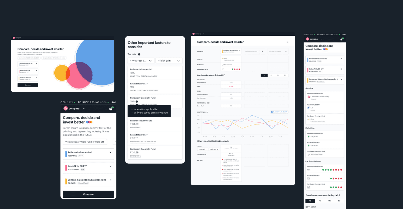
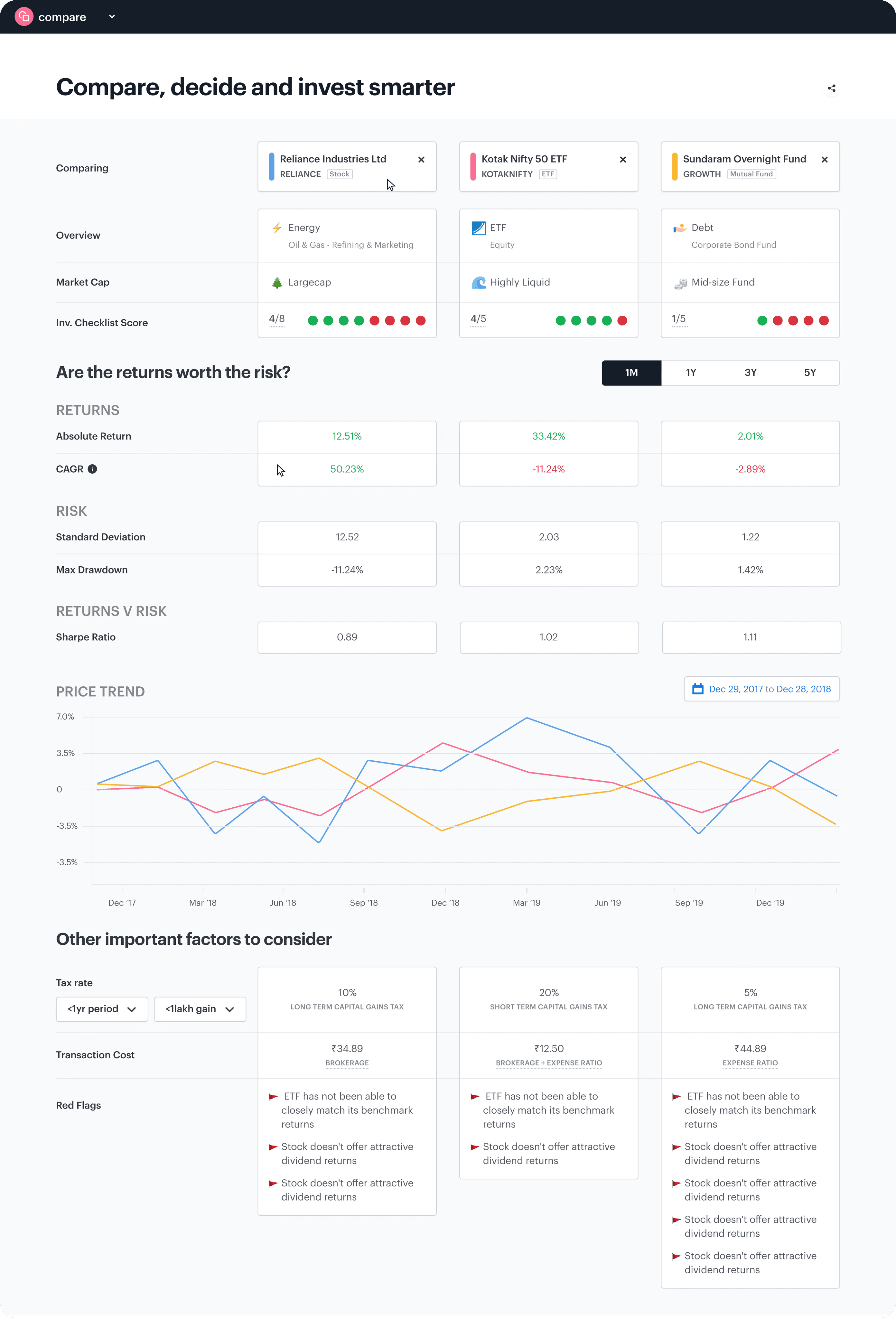
3. Tickertape: Compare assets dashboard
Why are we doing this?
Our goal is to help users compare different asset classes on common grounds, facilitating their decision-making process. While existing screener feature allow for stock comparisons, they are typically designed for power users and can be complex to navigate.
What is the user problem?
Users struggle to identify the best options among a few choices. Currently, there is no quick and efficient way to compare similar assets, when it comes to comparing different asset classes, it is unclear which metrics to consider.
What is the business opportunity?
There are no current products on the market that offer this feature. Implementing this will provide a unique advantage for TT, distinguishing it from competitors
What are the design constraints/goals?
Seamlessly integrate the tool into the overview page and create additional intuitive entry points.
Ensure the design is dynamic and unintrusive, enhancing user experience without overwhelming them
Design proposal: Why are we choosing this path?
On web we are going with the traditional compare structure found on most products compare section, ie: tables, keeping elements side by side to easily compare. Along with that we have also bucketed content into boxes to improve focus and aids skimming.
On Mobile however we have decided to go with placing elements below one another unlike web. Althought this pattern may not be the best to compare, it offers a better experience on smaller devices compared to keeping the elements side by side with horizontal scroll. Reason being when scrolling horizontally, users would have to keep in his memory the previous values, adding to the cognitive load.
To help with the longer scroll, we have also included a ‘Jump to’ functionality that would act as anchor links to various sections
Jobs to be done
Allow me to compare up to three assets simultaneously to make smarter financial decisions.
Enable cross-comparison of different asset classes so I can choose the best one for my needs.
Provide clear explanations of comparison terms to enhance my understanding.
Ensure the tool is easily consumable on mobile devices for convenience on the go
Target users
Novice retail investors
Advanced retail investors
Team
1 product manager and 2 client side engineers
Role
Research, UX/UI design, Design Systems
Interfaces
Android ,web app
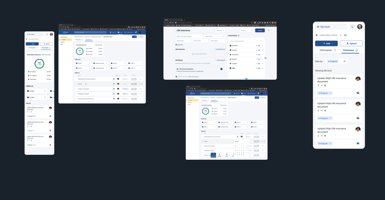
4. The Kinnect Company: HNI Asset Management dashboard
Why are we doing this?
To provide asset managers with a secure and organized tool for managing critical family information.To ensure high-net-worth individuals’ (HNI) assets are tracked and managed effectively.To enhance the efficiency of asset management processes for better client service and satisfaction.
What is the user problem?
Difficulty in managing and securing vast amounts of critical family and asset information.
Lack of a centralized and organized platform for tracking and reporting high-value assets.
Complexity in providing comprehensive insights and analysis due to fragmented data.
What is the business opportunity?
Streamline asset management processes, increasing operational efficiency for asset managers.
Attract and retain high-net-worth clients by offering a sophisticated, secure management solution.
Differentiate the SaaS platform in a competitive market by providing specialized tools for asset management.
What are the design constraints/goals?
Ensure the dashboard meets high security and privacy standards to protect sensitive family and asset data.
Design a user-friendly interface that simplifies complex data management tasks.
Provide real-time insights and reporting capabilities to facilitate informed decision-making.
Ensure scalability and adaptability to accommodate varying volumes and types of assets.
Jobs to be done
As an asset manager, I need to securely store and organize critical family and asset information, so that sensitive data is protected from unauthorized access and breaches.
As an asset manager, I need real-time insights and reporting capabilities, so that I can provide timely and accurate updates to my clients on their asset performance and status.
As an asset manager, I need a user-friendly interface that simplifies complex data management tasks, so that I can focus more on strategic planning rather than navigating the system.
Ensure the tool is easily consumable on mobile devices for convenience on the go.\
Target users
Asset managers
Team
Collaborated directly with the CEO, 1 backend developer and 1 front-end developer
Role
Research, UX/UI design
Interfaces
Web app